Canvas art · criticism · institutional critique · japanese-elements · 3D printing
Criticism of Curators
How museum blurbs shape what we see
This art piece is meant to explore how much of what we "see" in art is actually what we read about it. After visiting museums around the world and both world-class and slightly shady, I found that the curatorial blurb doesn't just contextualize art, but it actively rewires our perception of it and impacts our experience. I wanted to demonstrate my finding in my own art piece, and so my physical artwork is accompanied by two distinct blurbs: one that details the meaning of the piece and offers context otherwise lost, and another that is vague and succinct on purpose, like how you might find in a poorly curated museum.
The artwork itself is inspired by Japanese Shippo geometric patterns and Bauhaus curvilinear abstraction. Some friends of mine may recognize the Bauhaus curvilinear abstraction I'm referring to :) The stamp was modeled in Fusion and 3D-printed in PLA on a Bambu A1. The process for actually inking the artwork was, I soaked the stamp in black ink and pressed it onto canvas. Because of the stamp's texture, design, and how I created the ink, the ink naturally runs and bleeds down the surface.
I wanted the ink to run down the page slightly, and combined various ink coagulators, thickeners, thinners, and products I cannot pronounce for 1 intent. I wanted the running ink to represent a humanistic touch and the elements of nature, as uncontrollable as they are. The stamp is meant to represent an almost impossible, mathematical perfection (design created in Illustrator out of almost entirely circles cut up, with all elements aligned to be symmetric), while the bleeding ink was meant to remind us that we cannot create a truly perfect world, and that the laws of nature like gravity will always interfere.
Process — Two Iterations
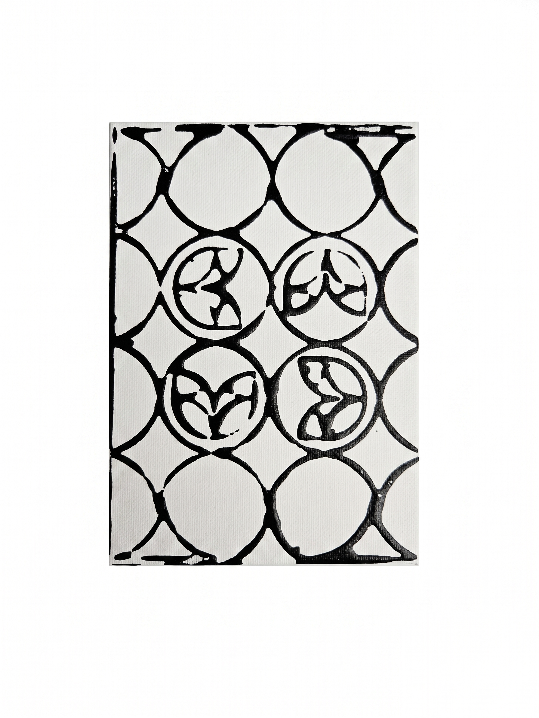
I. Less Ink — Intended Result
Intimate and Detailed Note
The unique pattern found here was modeled in Fusion 360 and printed in PLA on a Bambu A1, with Japanese Shippo geometric patterns and Bauhaus curvilinear abstraction inspiration. The stamp was loaded with black ink, and pressed once onto raw canvas. The stamp while meant to be perfect, cannot account for the laws of nature. How it holds the ink unevenly across its surface, how the pressure of a human hand varies from one corner to the next, how the ink feathers at the edge of each circle where the stamp lifts. The geometry holds its form, and the ink bleeds anyway.
Museum Label
Ink on canvas. 2025.
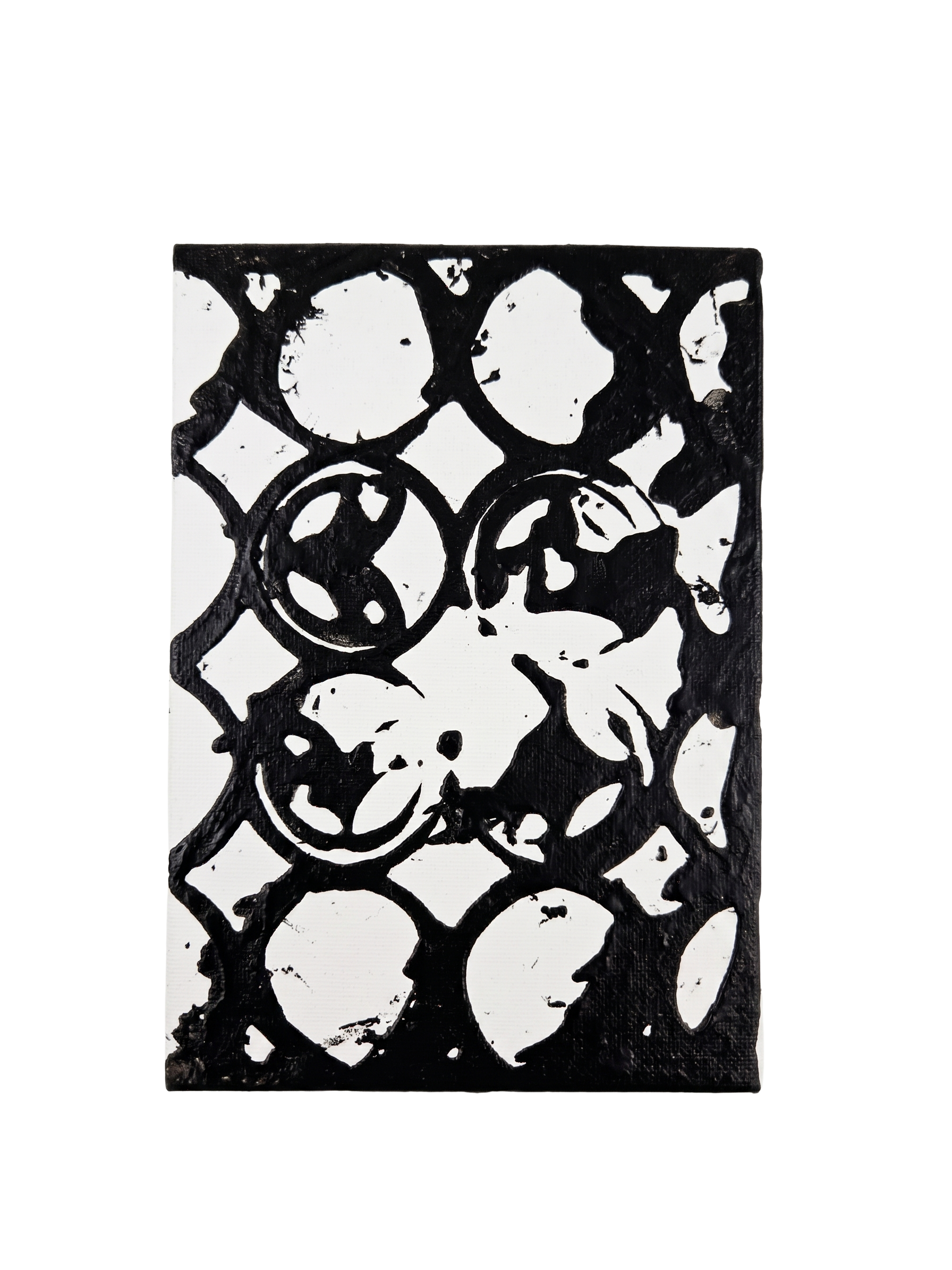
II. More Ink — Unintended Result
Intimate Note
This is the second try, using the same stamp, but with too much ink loaded. The negative space inside each circle disappears and loses its figure. In this case, the ink sat and spread sideways, flooding the open areas, and what remained afterwards is a record of the miscalculation: the same stamp, the same hand, but a completely different art piece. It demonstrates, without the initial intention, that the outcome of any act depends on conditions a user cannot fully control.
Museum Label
Ink on canvas. 2025.
A note: I also wanted to mention that the physical context of a museum like its lighting, wall color, the proximity of other works, and the flow of a visitor's path all shape your perception just as powerfully as any written label. The same object, hung at a different height or lit from a different angle, can become a different piece entirely. So try to notice not only what you're being presented with, but how it's being presented.