analytics · full-stack · llm · marketing
Complete · 2026
BLOXHUB Analytics Dashboard
Nordic Hub for Sustainable Urbanization, Copenhagen — Marketing Analytics Intern

BLOXHUB is a non-profit in Copenhagen, Denmark described as the Nordic hub for sustainable urbanization. BLOXHUB operates as a membership organization of architects, engineers, municipalities, corporations, and startups primarily in Europe. It operates as a super-connector for those in the sustainability and urban space, often taking projects with cities to improve their urban loneliness, well-being, housing crisis, climate adaptation plans, or generally implement circular economy ideals. I spent the summer of 2026 there as a marketing analytics intern. I worked primarily with the communications team, who publish on LinkedIn constantly but had no reliable way to tell what was working, which is a specific and ordinary problem: LinkedIn's native admin dashboard merely offers basic social media insights and metrics such as impressions, CTR, engagement rate, and demographics, with the option to export four spreadsheets of this data. There are no answers to telling you what specifically worked or why specific posts performed better than others.
The questions the team actually had were not how many impressions did we get, but instead: Does opening a post with a question beat opening with an announcement? Do event recaps beat event invitations? Are we posting about the themes we say we care about, or are we skewing more towards specific ones? LinkedIn does not answer any of those questions. If the communications team wanted to answer those questions, they would have had to manually tag each post, and when you post constantly, it's not feasible nor efficient. So the dashboard I built classifies them with an LLM model and answers these deeper questions.
Essentially, the dashboard ingests and classifies posts from LinkedIn spanning however far back you would like, and tags them accordingly. In the LinkedIn export, all the posts from LinkedIn during that specified time period are included, where the rows are each individual post, and the columns are information on the posts, including the text from that post. From here, the dashboard essentially ingests and classifies these posts across six dimensions, including its hook style, CTA, tone, structure, length, content type, and canonical company theme. Findings are then created when the classified post text is aggregated, allowing us to answer questions such as "In the past 30 posts, do posts with data-driven hooks have higher engagement than question based hooks?" or "Does our audience have higher engagement with short-form content or long-form content?" or "As a company, what specifically are we posting the most about?"
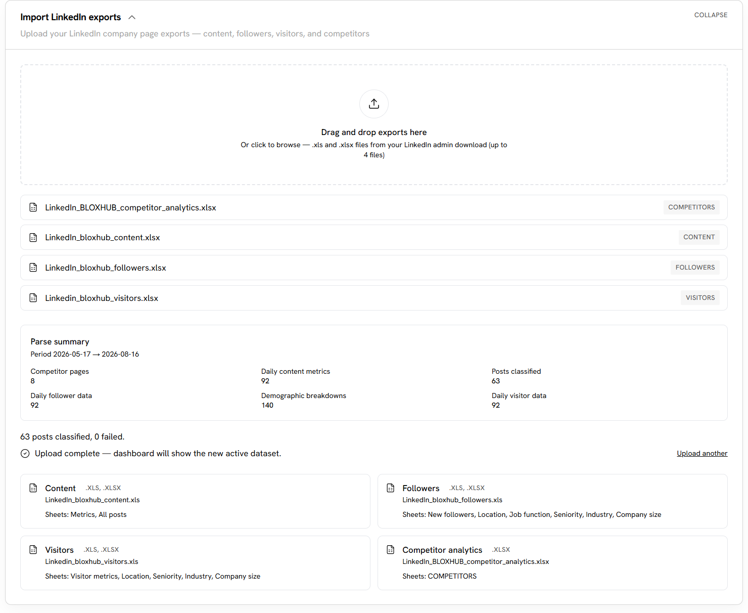
I. Four exports in, sixty-three posts classified, none failed
Part I — Deterministic facts, narrated
When designing the dashboard, I was wary of how LLMs can hallucinate, and so I leveraged deterministic code where one rule sits above everything else in the codebase. Deterministic code computes all facts, numbers, selections, and rankings. The model only classifies posts and narrates values it was handed. It never picks an example post or chooses a figure if there is a recommendation being made, and never decides which post won if there is a comparison being made. For context, deterministic code essentially always produces the same output and follows the same steps every single time it runs, as long as it is given the same input. Overall, the deterministic code and the LLM work together to create data-backed recommendations and insights that prevent hallucination while leveraging the power of the LLM's classification abilities.
Here are some examples where the deterministic code (or guardrails) can be enforced. Recommendation cards name which statistic to show and the system, via the deterministic code, fills in the required figure, so an explanation of a chart and the chart itself do not disagree with each other. Posts that the model nominates as specific examples of having a trait when creating recommendations are validated against previously stored classifications and backfilled deterministically, so a recommendation about question hooks cannot illustrate itself with a post classified as anything else. A hook labeled "Data-Driven" is re-classified unless a digit or a percentage actually appears in the post's opening, taking into consideration case-insensitivity (ex. "Eight" versus "eight") and free variation (ex. "8" versus "eight"). A post will not be classified as call-to-action if it cannot provide evidence of the direct quote in the post text. Whether a post has a link attached isn't determined by an LLM model; instead, it is derived from parser columns. And a separate guard blocks any suggestion from the LLM about images, videos, or carousels, because the system and LinkedIn export only ever sees post text and cannot know what media a post carried. Each guard is narrow, added after countless rounds of iteration to increase accuracy. Each one names a specific way the LLM output could have been confidently wrong.
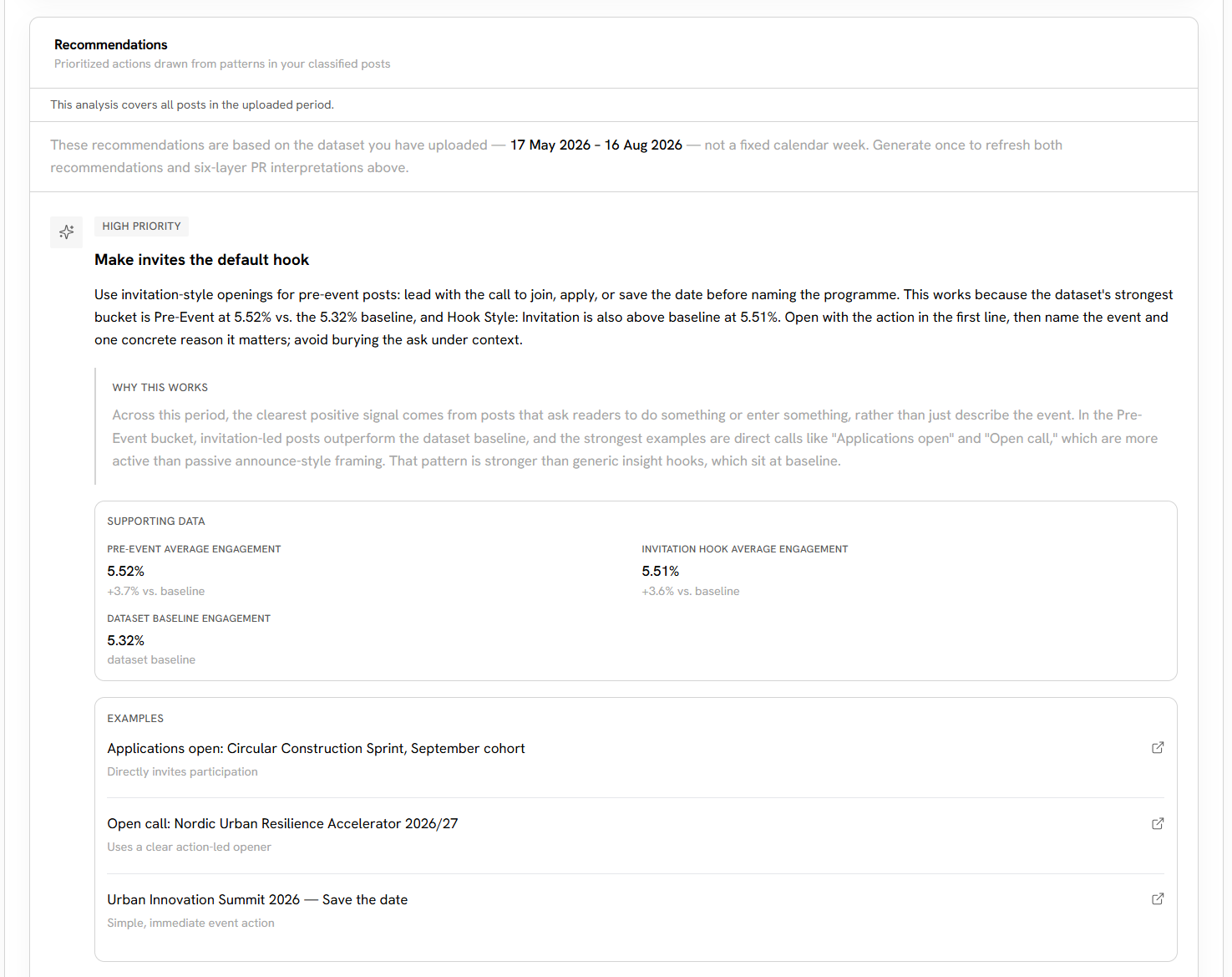
II. The card names the statistic; the system fills in the figure
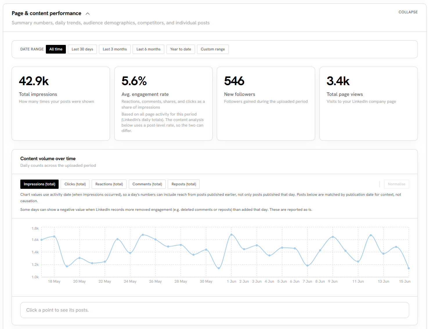
III. Every tile carries its own caption saying what it counts
One aspect of building this dashboard I was surprised by was how much of LinkedIn's data looked initially like a bug, throwing off some outputs. For example, the daily values are attributed to the day the activity occurred, so a spike can come from a post published months earlier. A day can also report negative engagement when there are deleted comments or undone reposts. Some location strings arrive with the country repeated, which is why a row can read as "London Area, United Kingdom, United Kingdom".
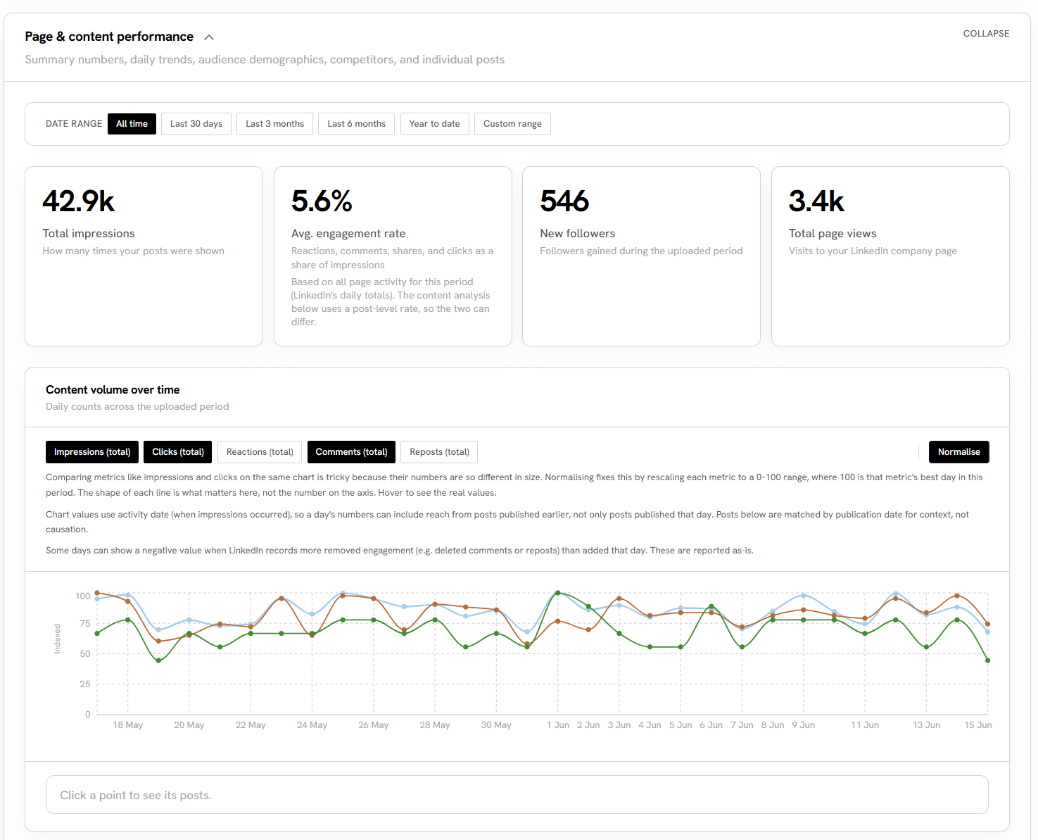
IV. Rescaled to an index, because the shapes are the comparison, not the axis
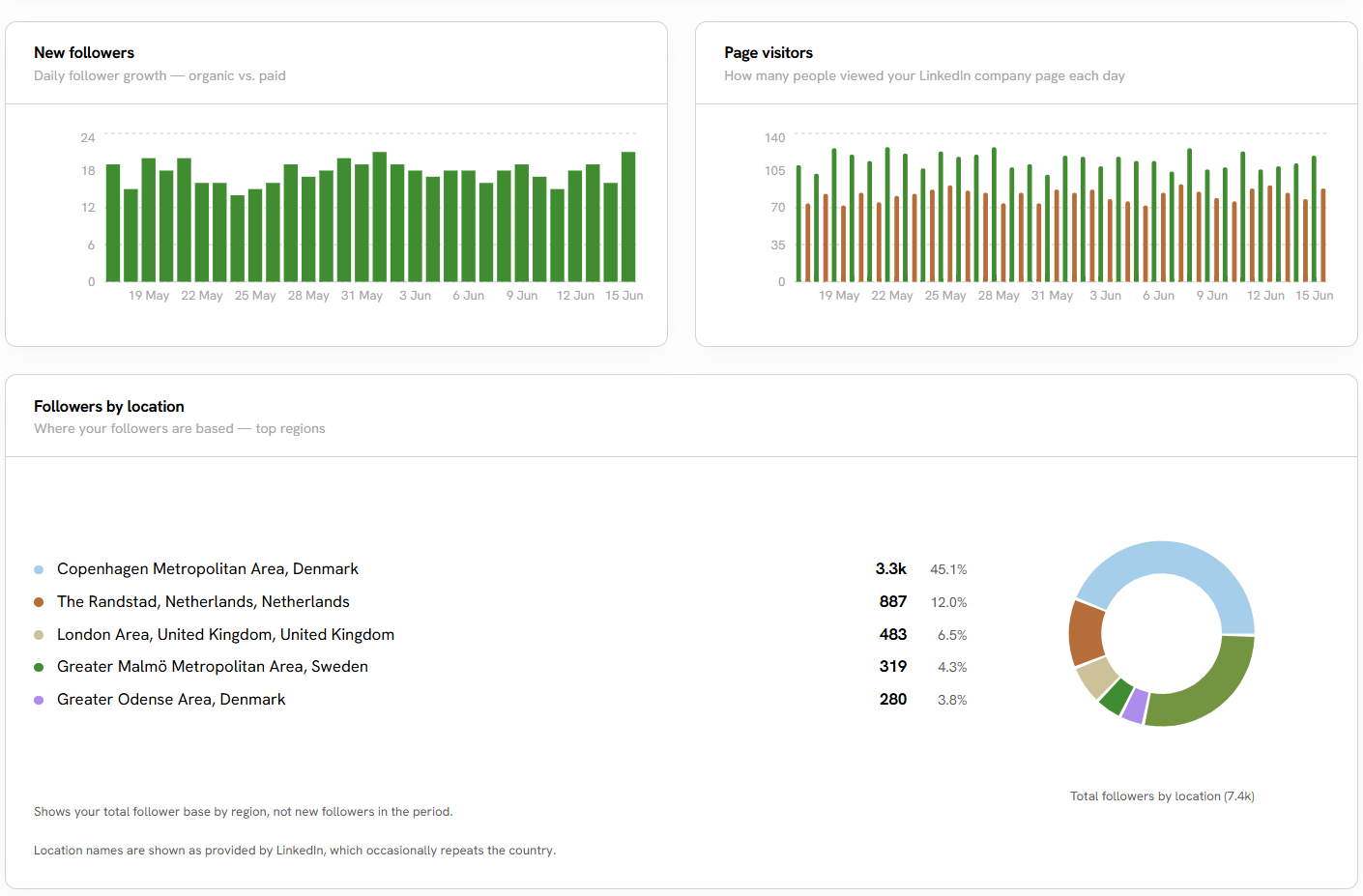
V. Reported as LinkedIn reports it, repeated country names and all
Part II — What the classifier is allowed to say
There are six layers per post: content category, theme, tone, hook style, structure and length, and calls-to-action and links. These layers include closed lists, meaning a post cannot be classified as both "data-driven" and "data driven." Every label the model returns is coerced onto the fixed enum (type of data using predefined values) by nearest match before it is stored; classifications stick to the closest legitimate value instead of creating hundreds of new categories.
The five themes came from BLOXHUB, not from the model. Circularity, Housing, Urban Regeneration, Wellbeing and Climate Adaptation are the organization's own strategic themes.
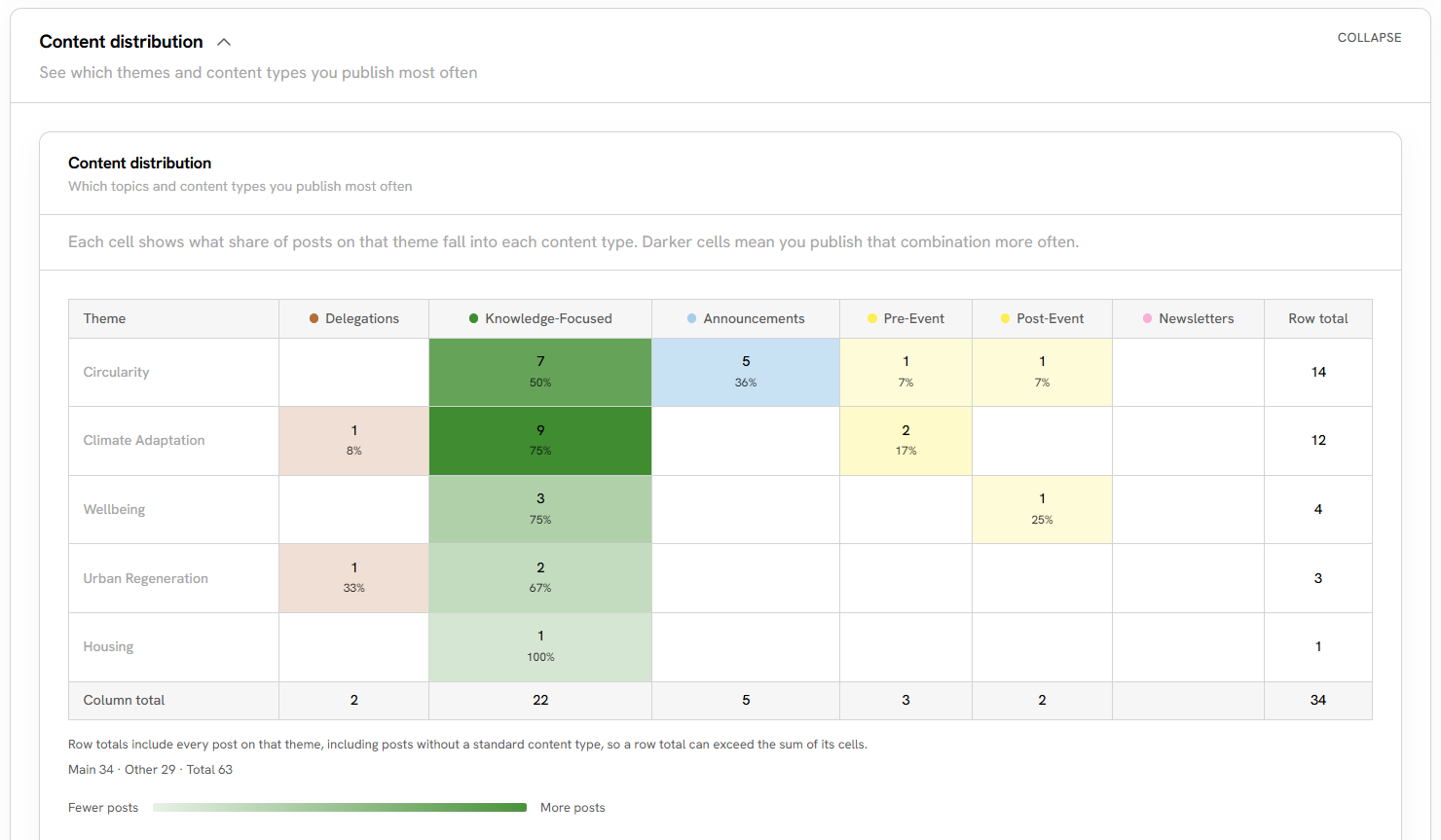
VI. Volume only — no engagement judgment anywhere in this view
Not everything maps into a company theme, which is the reasoning for this "Other" section. For recurring programs that are posted about, such as UNLEASH, Masterclass, or the AEC Hackathon, they are matched on keywords in the post text and moved into a separate heatmap matrix, with the stored classification left untouched. These are programs, not topics, and separating them at this section keeps the canonical heatmap pure.
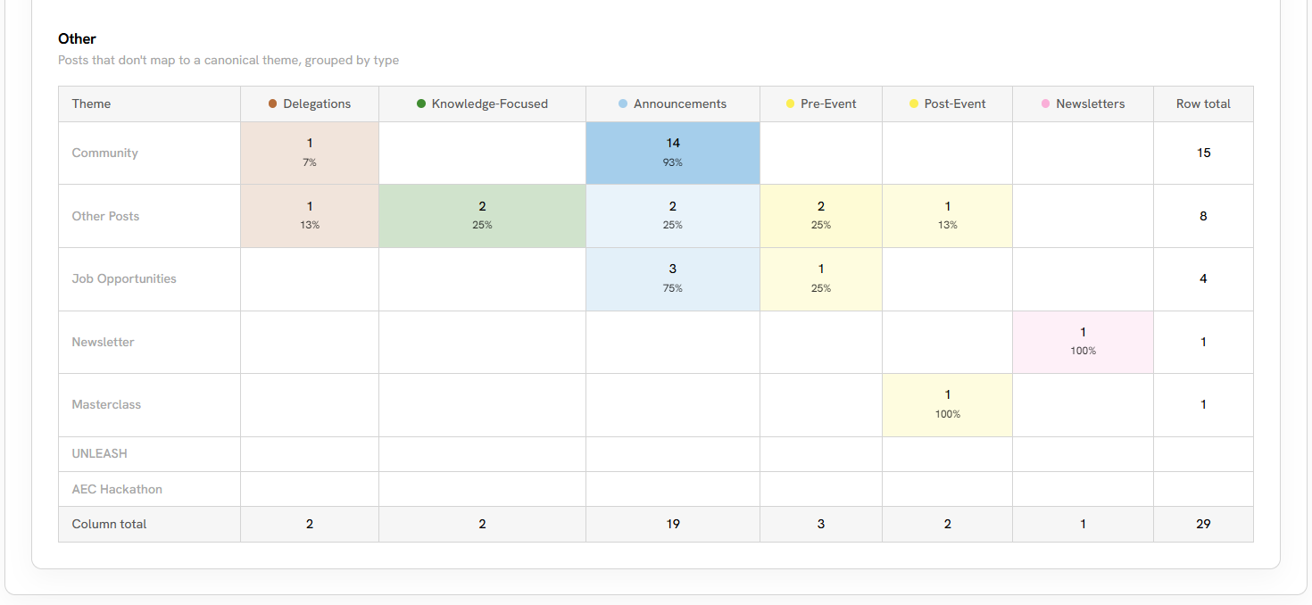
VII. Programs, not topics — held apart so the canonical matrix stays clean
The layer charts are the payoff. Each layer is a tab, each value a bar, each bar carrying its own post count so a pattern resting on two posts can be read as the thin evidence it is. The classification reference sits underneath, collapsed, listing every value the model is permitted to assign — because a reader who cannot see the vocabulary has no way to judge whether a label means what they think it means.
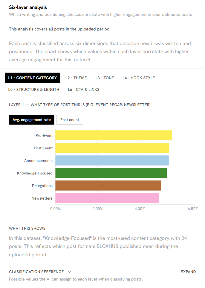
VIII. L1 — what type of post
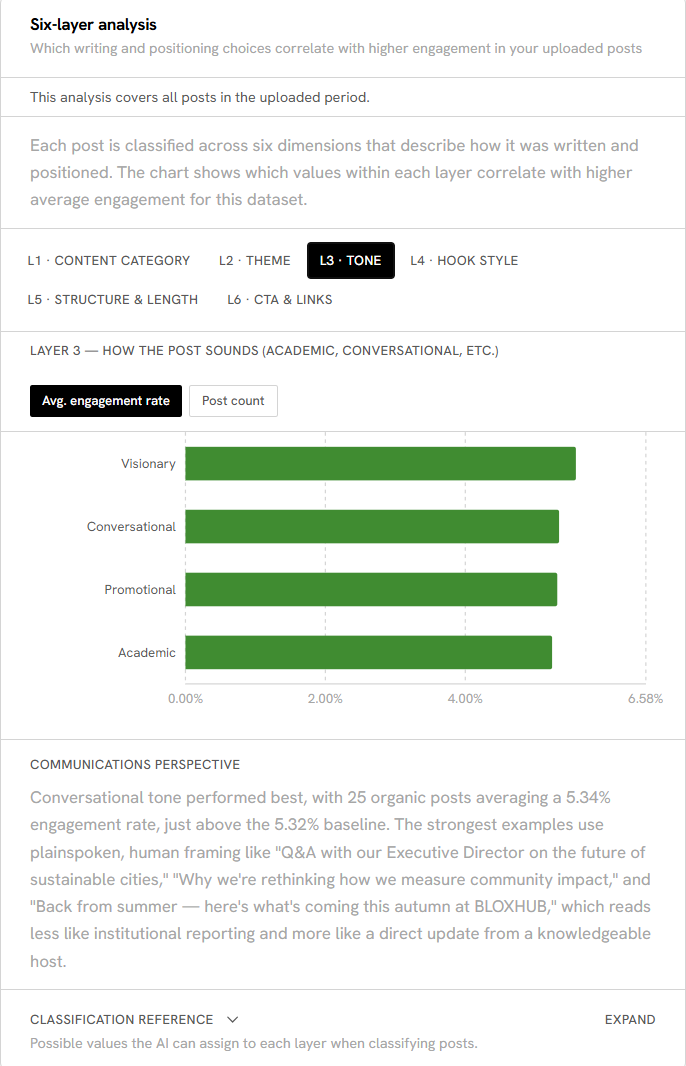
IX. L3 — how it sounds
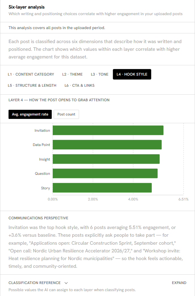
X. L4 — how it opens
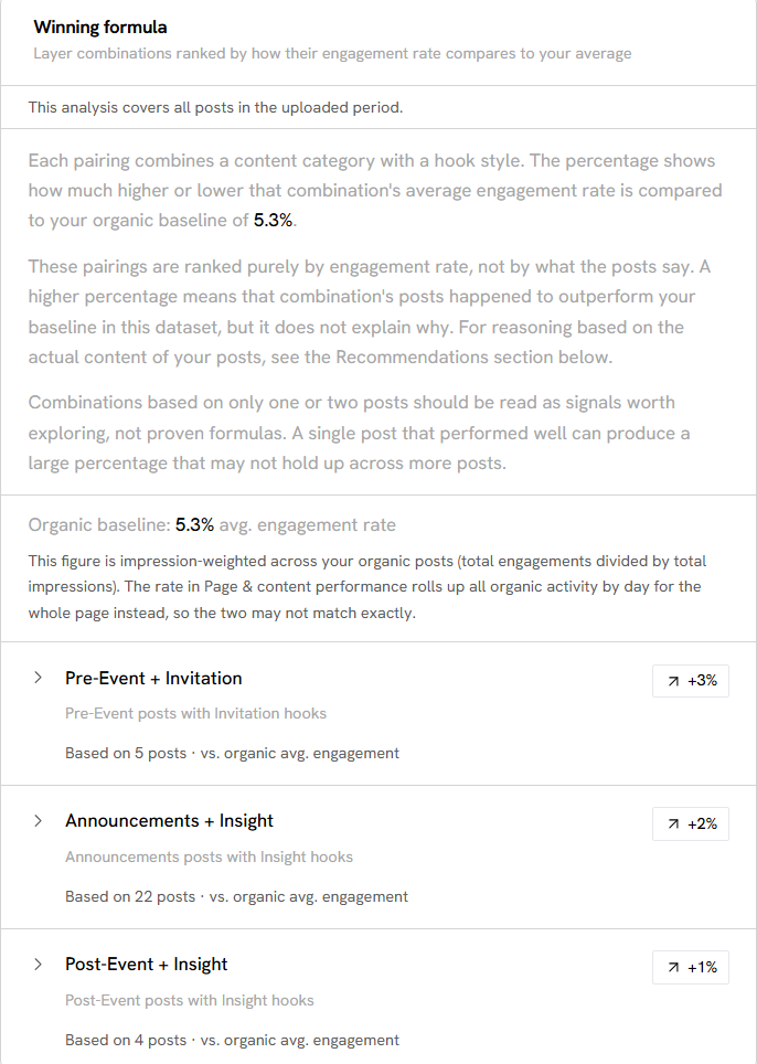
XI. Ranked on engagement rate alone, and the panel says so
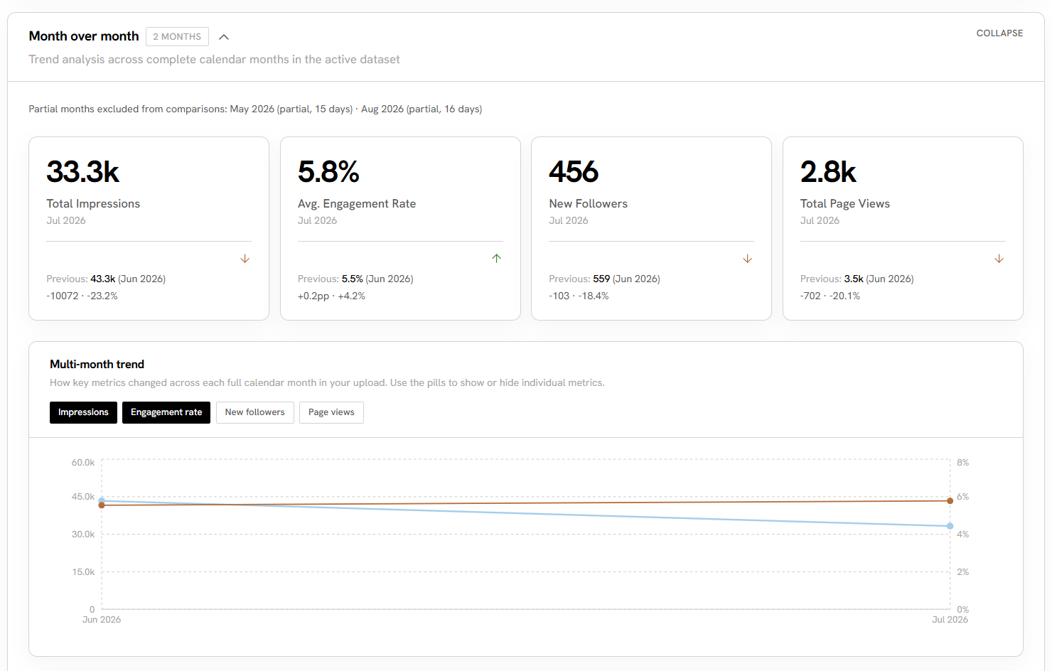
XII. Partial months are named and excluded rather than quietly averaged in
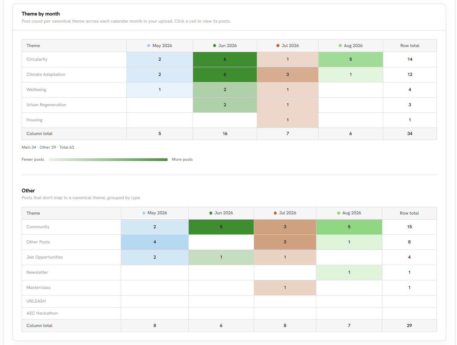
XIII. Canonical themes above, everything else below
Part III — Measuring the classifier, and what it got wrong
I tested the accuracy of my dashboard's classification by utilizing a test dataset, validation dataset, and training dataset. By the end of my internship, tone classification was put at roughly 80 percent accuracy and hook style at about 92 percent, with Question the most over-assigned label of the set. Content category and links were close to perfect, which makes sense as one is nearly structural (content category) and the other is derived from parser columns rather than LLM judgment (links).
One issue I initially ran into was classifying too many posts at once. In the current iteration, classification runs in batches of eight posts, reduced from an initial fifteen. At fifteen, the per-post output grew long enough that the response was occasionally truncated (cut) mid-JSON, which silently returns fewer classifications than posts. At eight, all posts were classified properly while being mindful of the resources it takes for classification (time + API cost).
Part IV — Built to be handed over
A small point to note is the constraint that shaped most of my decisions was interning for only 10 weeks, and the maintainers of the dashboard would not be natively technical. Because of this, I designed the dashboard in the following manner: Every upload creates a new dataset, activates it, and deletes the rest. There is always only one active dataset. I leveraged markdown files to guide the maintainers for any future changes they would want to make using AI agents. I also used GitHub Actions to automate and verify pushes to main, and ensured that connections between Vercel, Supabase, and GitHub all aligned.
Part V — The rest of the internship
AI literacy. As part of my internship, I educated the BLOXHUB team on how to best leverage AI as a tool. I taught the team how different LLM models work, how many of these AI tools have tools within them, such as deep research capabilities or web search capabilities, and generally explained some tips and tricks when prompting AI. For example, to be detailed with your prompt and to specify as much as you can, whether it's:
- what you've uploaded as context
- what your goal is
- what you would like the output to be
- the style that you would like

XIV. The same request, written twice — the slide everyone remembered
Competitor benchmarking. I looked at how comparable innovation hubs operate, such as Station F in Paris, MaRS in Toronto, Tech Barcelona, Here East and Plus X in the UK, Marineholmen in Bergen, and the New York campuses at Brooklyn Navy Yard and Industry City. I offered four recommendations: a predictable recurring events calendar, a Nordic Urban Innovators recognition campaign, an annual public impact report with quantified outcomes, and curated member discounts on legal, IP and software services, which raises the value of membership without touching the price or the building.
A thought leaders list. I created a list of individuals and organizations worth tracking and engaging, split into three lists because outreach tactics differ with various audiences: individuals for general audience growth, communities/organization pages for the same, and individuals for specific lead generation.

XV. The view from the terrace, central Copenhagen
A note on what is shown here. The screenshots are the live internal dashboard, running on sample data of a real LinkedIn Export. The source repository is private to BLOXHUB and the deployed app renders empty without an upload, so neither is linked. Nothing here includes individual team members' performance, although there is a portion of the dashboard dedicated to this. Photographs by JoLyn King for CIEE.